Project Info
- Architects: Schemata Architects / Jo Nagasaka
- Team: Jo Nagasaka + Naoki Takatsuka + Masami Nakata
- Location: Tokyo, Tokyo Metropolis
- Photographs: Nacasa & Partners
- Function: Offices, Shops
- Completion: November 2012
- Structure: Steel frame
- Floor area: 397.92 m² (2F)
- Material: Concrete, Steel, Wood
TAKEO KIKUCHI SHIBUYA | Schemata Architects / Jo Nagasaka
Words by mooponto Staff
November 30, 2012
When we were commissioned to design this store, it was a year after the Great Tohoku Earthquake. From experiencing such great disaster we realized the importance of communication in communities, and began to question the present situation of retail stores that are typically glass-clad buildings with no operable windows, where no interaction between street and store would happen.
We were given the original plan of the new building where the store was to be opened. It showed a building entirely clad in glass curtain walls, with only one large entrance in center and a gigantic counter right in front of it. It was a natural decision for us to reconsider this original design. The site is very wide and flat, and we decided to take advantage of this uniqueness to create a place where people can freely enjoy communicating with each other; we think offering good communication is the key to retail stores of today.
TAKEO KIKUCHI brand offers a wide range of clothes from casual to formal and it has customers across a wide age range from the twenties to fifties. Also, the site is situated on Meiji Douri Avenue connecting Harajuku and Shibuya, where you can enjoy watching exciting street views and people strolling around in various fashions. We worked out a design concept that would bring all these happenings on the streets into the store.
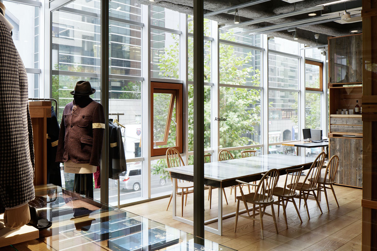
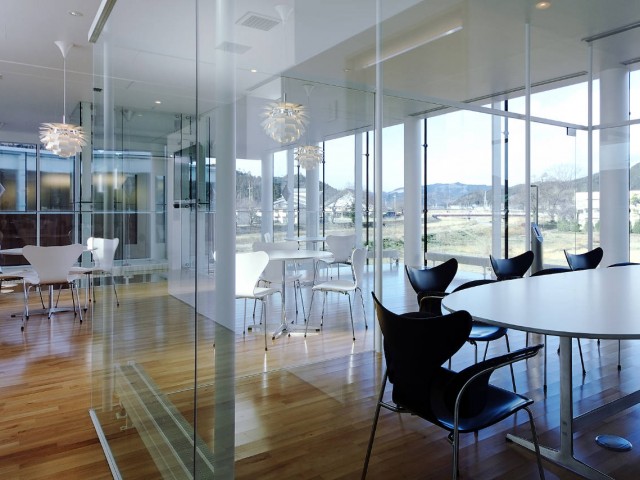
We questioned the fact that most shops and offices are enclosed without natural ventilation throughout the year and usually heavily air-conditioned in summer and winter. In this store operable wood frame windows are embedded in the glass facade to let natural airflow inside, so that building can breathe freely all seasons.
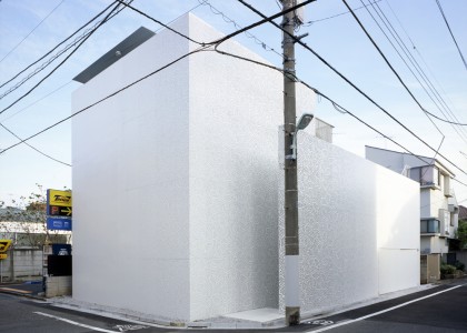
This store is very wide and flat, 25 m in width and 7 m in depth. We observed that people often find it uncomfortable to enter a store that is entirely visible from the street. So we made a soft and loose boundary like a forest, intending to allure people into the store. People pass through three spatial layers, outside of the facade, interior space, and garden in the back. And we place different elements to each layer to create sub-layers; benches along the facade, big and small wooden boxes on the first and second floors, and plants in the garden. Generally, a glass facade would reflect the light and street views and clearly divide exterior and interior spaces. But by inserting wood frame windows there, we intend to connect exterior and interior spaces both visually and physically.
Today we can easily buy clothes online, and we already have enough knowledge and experiences and know-how to judge good products from bad ones in our economically maturing society. What is the role of a flagship store then? We think the key is to offer customers lively shopping experiences; everyone deserves a good time to really enjoy various products and to feel the essence of the brand. There are so many clothing stores in Shibuya, and we intend to make a difference by creating a store where customers can comfortably shop and stay for a long time. We locate three different places for relaxation, benches along the facade, garden, and cafe on the third floor. Shopping would not be fun if only looking at available products and listening to shop staff’s suggestions. Here customers can sit and relax, and take time to contemplate what products would suit their styles best.
We wanted to avoid one-way shopping circulation. In order to allow for freer and multiple circulations, we locate four entrances along the street and placed display furniture randomly in space. And no cash register counter is located here, as we think its presence is often too dominant in-store space.
Here shop staff will assist you with warm hospitality and highly professional services that stand out from other clothing stores.
We intend to fill this store with a relaxed and natural atmosphere where joyful interaction between customers and shop staff will take place. On sunny days shop staff would sit on benches outside and wait for customers, and good conversation will take place here and there.
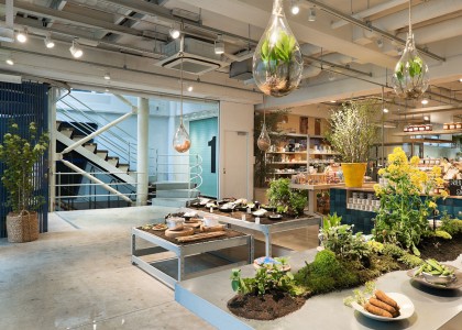
In order to achieve flexibility in space, we divided space by placing simple wooden boxes in various sizes instead of fixed partitions. And by combining them with white-painted steel parts, we compose display furniture in different styles according to the needs of each section. Some of the furniture consists mostly of steel, and other consists mostly of wood. There are no set rules of design or stories to be told. All are designed without repeating the same rules or stories. Our intention is to provide various viewpoints so that customers can participate in the space in multiple ways.
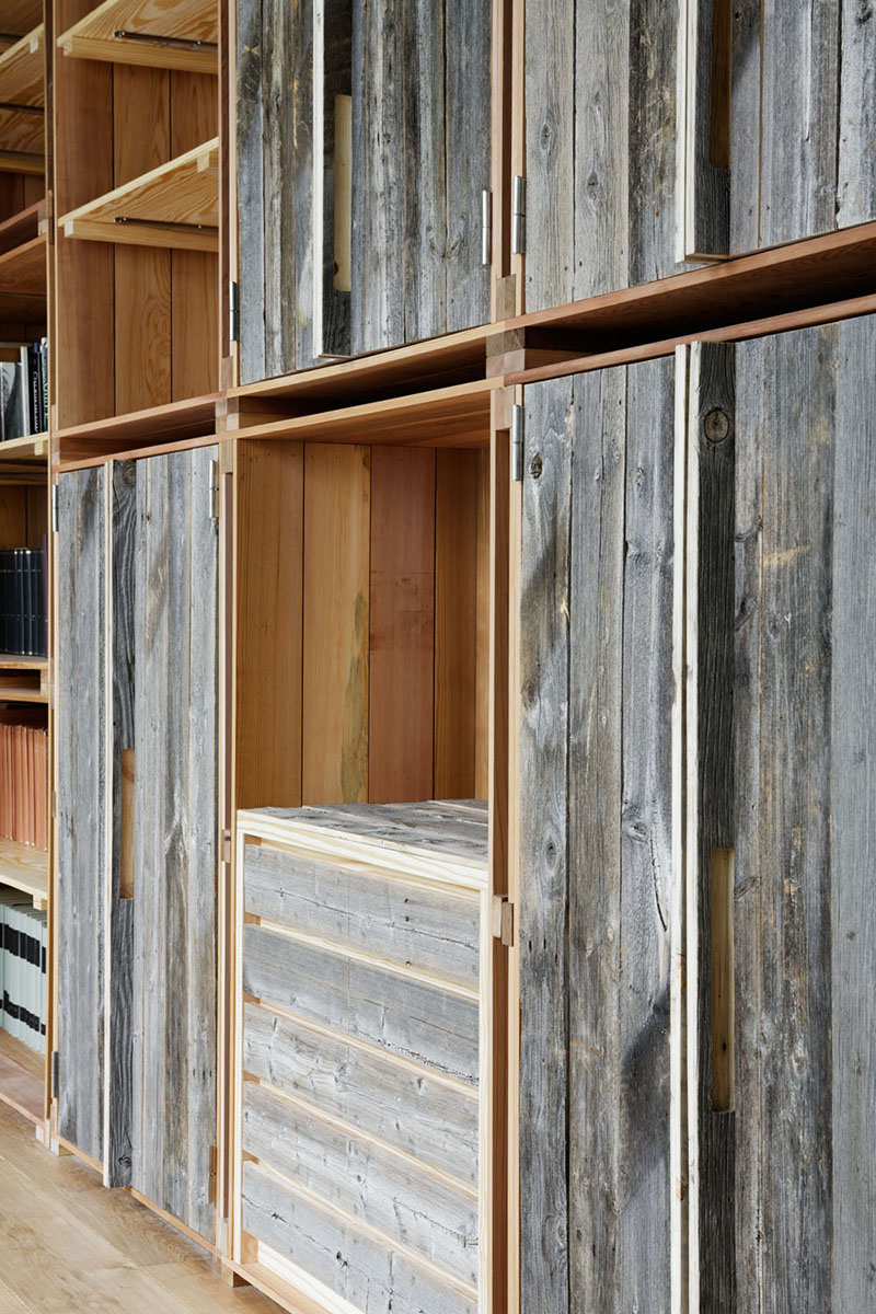
We want to inspire customers to look at things with fresh eyes and minds by revealing “extraordinariness” in ordinary things. Shelves in the atelier are made of a unique combination of old and new parts of wood shelves. By slicing old wood shelf parts, a fresh section of wood would surface, and that would act as a mediator between the old and new materials. Old Windsor chairs are thoroughly sanded to get rid of old polish and natural wood surface is revealed. Our idea is to invert the old and the new, and they would eventually merge into each other to create something different. In the same way, we would like to redefine softness and hardness. Cabinet doors are lined with leather, concrete walls are soft-patterned, and soft-shaped benches on the outside are made of concrete using fabric mold. Softness and hardness merge into each other to create new expressions we’ve never seen before.
We intend to create a mutual relationship between designer and customers by placing Mr. Kikuchi’s atelier directly adjacent to the dress wear section on 2F.
Previously a major apparel company called World was dealing with products of Takeo Kikuchi Brand, and during that time there was not much direct interaction between customers and the brand. Here in this store products are dealt with directly by the brand and there will be much more direct interaction between the brand and customers. In this way, they gain a further understanding of what customers really want. And Mr. Kikuchi can also actually see and feel customers’ fresh response to his designs, and customers can actually see and be inspired by Mr. Kikuchi’s daily outfits. There we can enjoy and experience the making process of Takeo Kikuchi’s clothes, get to know the brand’s essence, and will like the clothes more.


