Project Info
- Architects: satoru hirota architects
- Team: Satoru Hirota (lead architect)
- Location: Sano, Tochigi Prefecture
- Photographs: Atsushi Nakamichi / Nacasa & Partners
- Function: Office buildings, Warehouses
- Completion: 2008
- Structure: Steel frame
- Floor area: 1094.05 m² (3F)
- Material: Steel
muratajyuki headoffice | satoru hirota architects
Words by mooponto Staff
August 30, 2012
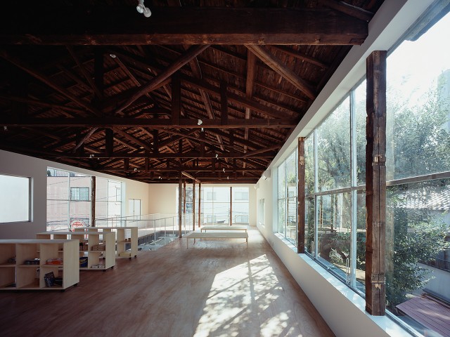
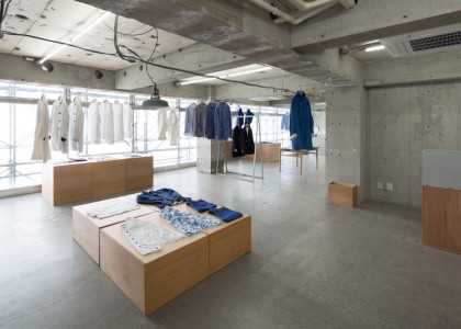
Nordic sense of simple, clean interior and white colors space has become a refreshing and placed the furniture and lighting fixtures. It’s like working in a resort location.
The first floor is workspace: office and president’s room, etc. The second floor is reception space: reception room and lounge, meeting booth, etc. The third floor is event space: main conference room and small conference room, etc. Void of entrance ties them.
Look south and the east side makes the area of the opening few, and suppress temperature rise by shooting on the day of summer. The curtain wall facing north and the west side is all aspects by the double-glazed glass (12 mm + air 12mm + 12 mm).
Exterior: design reduces contamination to a low-pollution type anti-fouling paint.
Glass: the process by applying an anti-fouling coating photo-catalyst is a weather-resistant sealant and is used to enhance the durability of members.


