Minimalism

House of Vision | FORM / Kouichi Kimura Architects
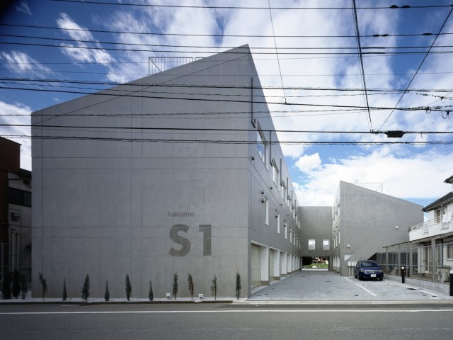
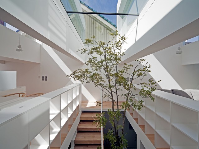
House of Vision is located at the foot of a hill where the fields and houses are mixed together. The client's desire was "to live while feeling nature without being bothered by looks from the neighbors". To make the best...
Read More
House NA | Sou Fujimoto Architects
House NA is an entirely transparent residence consisting of 21 individual floor plates at different heights, contrasting the typical concrete units.
near house | MOUNT FUJI ARCHITECTS STUDIO
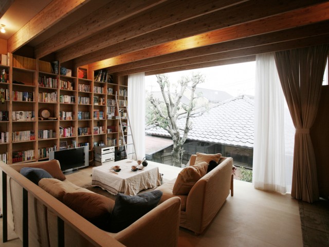
near house is a smart solution on a cramped plot consisting of two separate units. The first building serves as a gatehouse to the main family residence.

TAKEO KIKUCHI SHIBUYA | Schemata Architects / Jo Nagasaka
TAKEO KIKUCHI SHIBUYA is a flagship store with timber-framed windows enabling natural ventilation. Clothes are displayed in wooden display cases.

House in Yamasaki | Tato Architects / Yo Shimada
House in Yamasaki consists of three units. Two of them have translucent polycarbonate walls allowing enough light in even during the winter months.
PLUS | MOUNT FUJI ARCHITECTS STUDIO
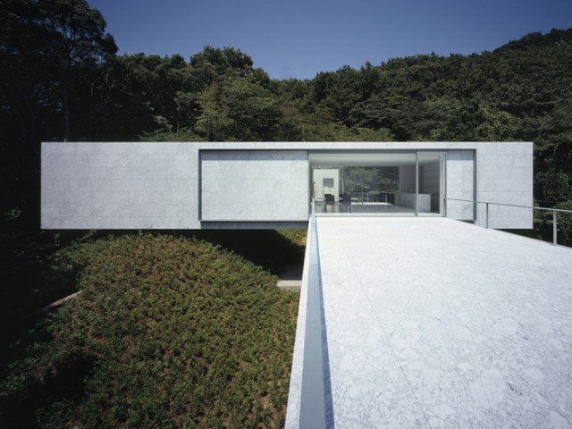
PLUS is a weekend house on the mountain plot and has a view of the Pacific Ocean. The simple design blends the house with the landscape.

TYM | no.555
TYM is a unit in a business district of Nagano City serving as a house and a hair salon. The space is timeless and can endure future neighborhood changes.

XXXX house | MOUNT FUJI ARCHITECTS STUDIO
XXXX house is a functional plywood space used as an atelier and a gallery with four kinds of panels forming a unique X-shaped structure.

House in Tamatsu | IDO, KENJI ARCHITECTURAL STUDIO
House in Tamatsu is a minimalist unit with a light wood interior palette and concrete. The large windows capture natural light, making the space airy.

KRE | no.555
KRE house has a huge garage to fit nine cars which can be custom-lift to the living room floor. The seemingly floating rooms make the unit more spacious.
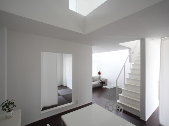
Omihachiman house | ALTS DESIGN OFFICE
Omihachiman house uses stairways and apertures to divide space into units that seem large and airy because of the white color and minimalist details.

Hue plus | Schemata Architects / Jo Nagasaka
Hue plus is a space designed for an image agency. Untreated concrete walls and wooden floors make it more a modern, social space instead of a workplace.

House in Takatsuki | Horibe Associates
House in Takatsuki makes use of a narrow plot by extending vertically across three floors. Rooms are connected with wooden blocks that seem to be flowing.

